
NEW YORK CARES REDESIGN
Desktop & Mobile Site
01.
T H E I S S U E
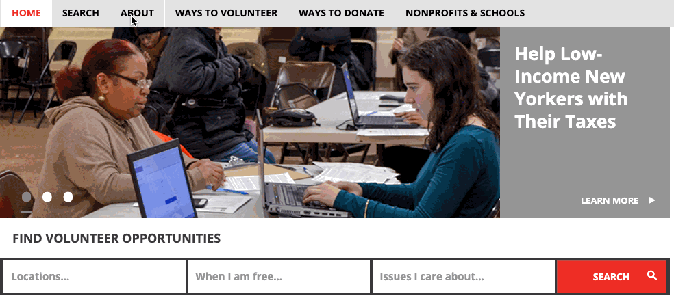
New York Cares is a non-profit that mobilizes New Yorkers in volunteer service. Annually, they assist over 52,000 New Yorkers to give back or create community-driven solutions. However, their website's last update was in 2012. The site needs significant modification to its information architecture that fulfills the following goals:
Greater Discoverability
Clearer Site Map
Easier Access to Program Areas
02.
U S E R G R O U P S &
P E R S O N A
For this redesign, our team of three, focused on New Users. These are individuals who visit the New York Cares site for the first time. They have little to no volunteering experience and no inherent pull to the website.
We studied the following age groups:
12 - 18 [High Schoolers]
18 - 24
25 and older
Among the three groups, I focused on 18 - 24 year olds.

Research Methodology
I had 12 participants take part in two separate research methods. 10 participants took an anonymous questionnaire with 11 open-ended and multiple choice questions. Two participants each took part in a semistructured video interview. My questions focused on finding the motivations and barriers for non-volunteers, such as “what is an obstacle to you volunteering?”
All the participants were over the age of 18 and lived, worked, studied, or have lived in the tristate area. An understanding of this group’s motivations, attitude toward volunteering, and any unmet needs would help in building a site that is able to convert these new users into returning users. Additionally, these results could help to improve the sites’ discoverability among audiences outside of the volunteering spectrum.
Below, are my findings :
LACK OF TIME
New Users feel really pressed for time, notably 60% are students. New Users feel they must expense their limited time to search for opportunities and vet organizations’ credibility. For this reason, many choose not to volunteer. However, 80% remain highly open to the idea of volunteering.
WORD OF MOUTH
New Users are more likely to be receptive to the insights of their friends, partners, or acquaintances than they are internet searches. The impact of information shared through word of mouth, digital or otherwise is amplified when shared by someone they know.
ALTURISTIC
New Users are altruistic and desire to be committed, despite infrequent volunteering. 60% of New Users chose “Helping the less fortunate & Community” over options like “Rewards and Benefits” as a reason to volunteer on an anonymous questionnaire. According to interviews, they would commit long-term if it were an issue they truly believed in.
PERSONA:
JANE BURGESS
INSPIRED BY RESEARCH CONDUCTED:
21 year old, marketing student
New Yorker
Always pressed for time as a student, social media intern, and nature blogger
Dislikes being disconnected and time consuming searches
Tech-savvy, but relies on recommendations from personal relationships before the internet
Motivated by making a positive influence & empowering communities leading change
Values meeting likeminded people & making new friendships


Final User Group: H I G H S C H O O L E R S
Ultimately, our team chose High Schoolers as our final user group because we felt it would be most narrowed in focus. A great degree of students expressed a proclivity for volunteering either for fun or for their supplement their studies. Many of the findings for High Schoolers, overlapped with the age group I reviewed.
Below are the key traits we determined :
SOCIAL MEDIA
High schoolers’ show more interest in things if there is a social media aspect. The concept of personalizing & sharing an experience is very important to them.
ISSUE RELEVANCE
Student's tended to have at least one social issue they felt a strong connection to. High schoolers were most engaged in volunteer opportunities that have to do with their interests. An example is athletes doing sports-related work.
FRIENDSHIP
Aside from giving back or improving their resumes, High Schoolers are interested in making friends through volunteering. They would like to make volunteering a charitable and social opportunity.
TIME
Students feel pressed for time because of their classes and extracurriculars. They favor brevity and imagery over lengthy text.
03.
Our competitive review began by analyzing 10 of New York Cares’ direct and indirect online competitors. All of whom function in the capacity of providing volunteer opportunities to visitors. We hoped to help New York Cares stand out.
C O M P E T I T I V E R E V I E W &
S T R U C T U R I N G C O N T E N T

M A I N T A K E A W A Y S
INTERACTIVE DESIGN
Users are more likely to appreciate interactive experiences on sites. Displaying statistics visually is more engaging and helps effectively reach audiences
SIMPLE
NAVIGATION
Users benefit from one of form of global navigation. In contrast, having too many options overwhelms visitors. Precise navigation improves experience.
VOLUNTEER PROFILE
This feature personalizes experiences for volunteers, which prompts committed volunteering and helps foster a community


Sorting Content
Using Optimal Workshop, we went through three rounds of testing users to complete our site map. The first round involved crafting more concise wording for our subcategories—for example, ‘Volunteer Opportunities’ in lieu of 'projects.' Following this study, our initial main categories went down from nine to seven.
Next, we conducted a tree test study focused on easing the navigation of subcategories that were confusing or had overlap-for example placing “recruiting volunteers” under “Volunteer” or “Partner with Us.” In analyzing our findings, we found that certain subcategories needed to be relabeled to be even more concise and that some had to be relocated not precisely on what made the most sense, pragmatically, but what would make the most sense to an initial user.
Below are the main findings :
WORDING MATTERS
We posed a task asking users to find a way to request donations on the site. Despite our link stating “Ways to Donate,” users would click this option instead of the correct option, “Outreach Services” to locate a way to request donations. Users clicked on “Ways to Donate” because it had the key term “Donate.”
ANTICIPATE DIFFERENCE
When users are unfamiliar with a site, they are more likely to click around before making a decision. In the results from our tree testing study, we found that most questions yielded users to make final decisions only after clicking on almost all of the options. Users came to final decisions—wrong or right—by constructing their own definitions using information provided.
CHOICE CAN PARALYZE
We gave users the ability to create new categories. However, most users were apprehensive to create their own. Instead, the majority stuck to our proposed categories, even though it meant creating huge lists of subcategories.
F I N A L O R D E R
After the completion of our studies and the analysis we ended up with: Ways to Donate; Ways to Volunteer; About Us; Press; Contact; and Partner With Us.
Below is our final site map :

04.
P R O T O T Y P E S
Building off our new site map and user research, we created two prototypes.
As a team we did the following :
Created a desktop and mobile paper prototype
Conducted user tests
Adapted our prototype to users’ reactions to navigation
Constructed a final high fidelity prototype to address the needs of New York Cares

PAPER PROTOTYPE
Our group constructed a mobile and desktop paper prototype to address the desires of our user group, high school students. Students prioritized making friends and brevity in their searches.
Thus, our redesign was heavily reliant on interactive graphics, such as maps instead of lengthy plain text. Additionally, we also added functions such as a customizable volunteer profile. Beyond showcasing their registered events, the profile allowed for sharing photos, inviting friends, and saving volunteer opportunities.


U S E R T E S T I N G
Our two tasks for participants were meant to test users’ ability to locate and navigate our interactive designs. Our two tasks included: Registering for a volunteer event and viewing their volunteer profile with their registered event listed. Our design, particularly our event search was well received, but we did have a few UX problems.
My takeaways are below :
DON'T ASSUME, ANTICIPATE
In our prototypes, we at times left buttons unlabeled, such as the “continue” arrow and repeated volunteer interest icons. We presumed that the use of color and drawings would be enough to direct users. However, the lack of labeling caused some users confusion and a need to ask for directions.
AVOID FEATURE OVERLOAD
Some participants expressed concern with the newsfeed feature on our volunteer profile. Participants were apprehensive to the feature, feeling it may be too active and distracting. Although engaging, too many options made certain users less happy and likely to continue repeated use.
DETAILS, PLEASE
When testing our prototypes, we found our calendar design to be a little too oversimplified. Instead of presenting the dates and times for events at the start, we asked users to select a calendar box with an icon to display this information. Some users expressed that this made selecting volunteer opportunities a bit more confusing as they could not see the descriptions immediately.

LOCATION MAP
M Y F O C U S : Easier Access to Program Areas
C H A L L E N G E : Reduce text and users' search time
S O L U T I O N : Interactive Map of New York's 5 Boroughs to locate volunteer events.
Users can place a pin on the location they want to volunteer at or type their zip code in the search bar


UX FIXES MADE IN FINAL PROTOTYPE:
Navigation instructions to help users orient themselves. “Drop a pin to find a volunteer location.”
Labels that imply outcomes, for icons, buttons, and directional arrows on site. i.e., "Next" button
EVENT CALENDAR
M Y F O C U S : Easier Access to Program Areas & Discoverability
C H A L L E N G E : Reduce users' search time & increase event share-ability
S O L U T I O N : Interactive calendar with icons categorizing events
& ability to share to social media profiles or email


UX FIXES MADE IN FINAL PROTOTYPE:
Allow more event details to be present at first glance. The details included would be date, time, event title, and a volunteer interest icon
VOLUNTEER PROFILE FEATURES
F O C U S : Discoverability
C H A L L E N G E : Allow users to share their experiences with NY Cares members & non-volunteers to increase outside interest and strengthen the community bond. Give volunteers a means to socialize and make friends
S O L U T I O N : Chat feature for volunteers to communicate and a live feed for volunteers to see and post photos of events to their volunteer profile or social media accounts


UX FIXES MADE IN FINAL PROTOTYPE:
Participants were apprehensive of the newsfeed feature, feeling it may be too active and distracting.
The redesign became a tab system for users to switch between the events calendar, newsfeed, and groups.
The user can select the features they wish to display on their profile.
05.
C O N C L U S I O N
As a team we sought to tackle the following concerns for New York Cares:
Greater Discoverability
Clearer Site Map
Easier Access to Program Areas
Ultimately, our research led us to create a website with a simple navigation flow that favored graphics instead of heavy text. Our designs use of interactive graphics supports youth participation and ease of navigation i.e., location map & event calendar. Whereas, our personalizable features such as the chat and live feed supports discoverability by using social media to attract more attention to New York Cares, its causes, events, and volunteers. The chat also supports the youths' desire to socialize and make friends while volunteering. Ultimately, we felt these changes would boost volunteer numbers as well as help more individuals in need.
Given, the opportunity we would have liked to expand our design to age 18 and above. There was a large degree of overlap in the motivations between High Schoolers and 18 - 24 year olds. I would have liked to conduct user tests to learn their perspective.